

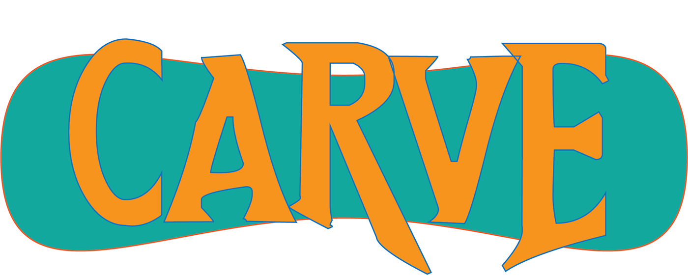
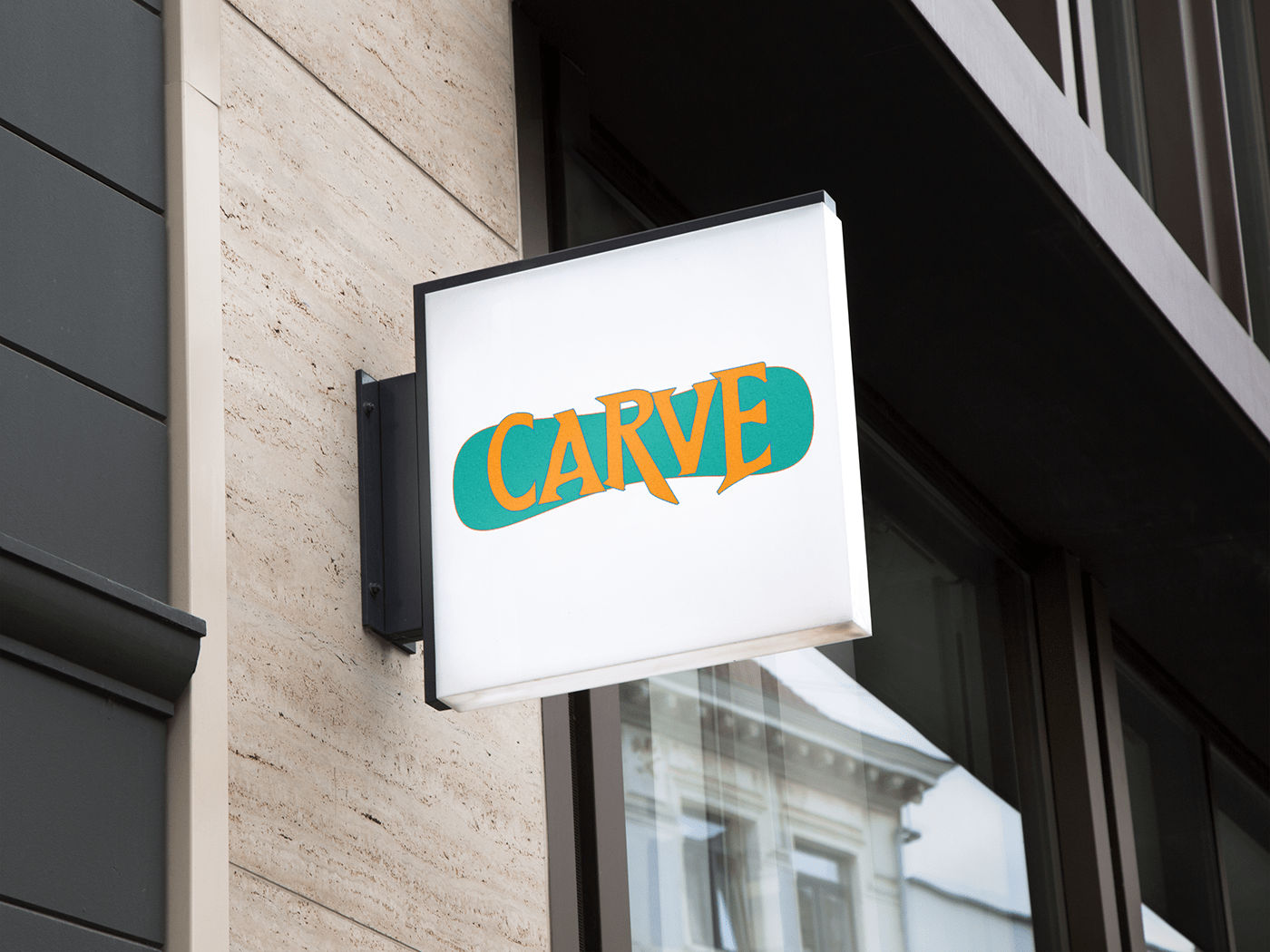
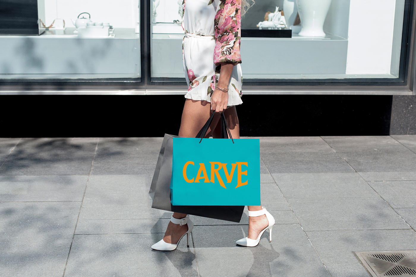
My company is a snowboard store that sells snowboards and clothes. The target demographic is snowboarders. My design choice reflects this because I used bright contrasting colors and a fun font, because when I am looking for snowboards, I usually pick the ones with fun bright colors and a cool design. I made the font bigger than the background so it looks like the font is on top of the board instead of a part of the board. I chose colors on the opposite side of the color wheel so that they pop against each other when looking at the logo. I also outlined the shapes in brighter colors of the opposite color to make them stand out against each other.


